Azuria
Complete redesign of 'Les Essentiels d'Ana' into a benchmark platform combining product directories, news, and future services (courses, coaching).

Context
Transitioning from a founder-led brand ('Les Essentiels d'Ana') to an institutional entity ('Azuria') represented a major strategic pivot. The challenge: designing a scalable ecosystem independent of its founder's image, while capitalizing on a highly engaged audience of over 12,000 subscribers. More than a simple rebranding, this was about laying the foundations for a true benchmark media platform.
The platform had to anticipate the diversification of its offerings (nutrition, wellness, lifestyle) by structuring an architecture ready to host training cohorts, personalized coaching, and retreat bookings. A forward-thinking design, engineered to absorb the company's future growth without ever compromising the intimacy of the relationship forged with its audience.
Role
As a Freelance Designer, I guided Ana in defining her ambitions to translate her vision into a tangible universe. From the original art direction to technical implementation, I conceptualized an organic visual identity with subtle marine influences. My goal: to instill a sense of trust and freshness, rigorously avoiding the clichés associated with the wellness sector.
The ideation materialized through iterative prototypes, followed by precise full-stack integration. Aware that a social audience consumes content predominantly on smartphones (90% of traffic), we established web performance as an absolute imperative, resulting in an ultra-fluid and near-instantaneous mobile experience.
Productions
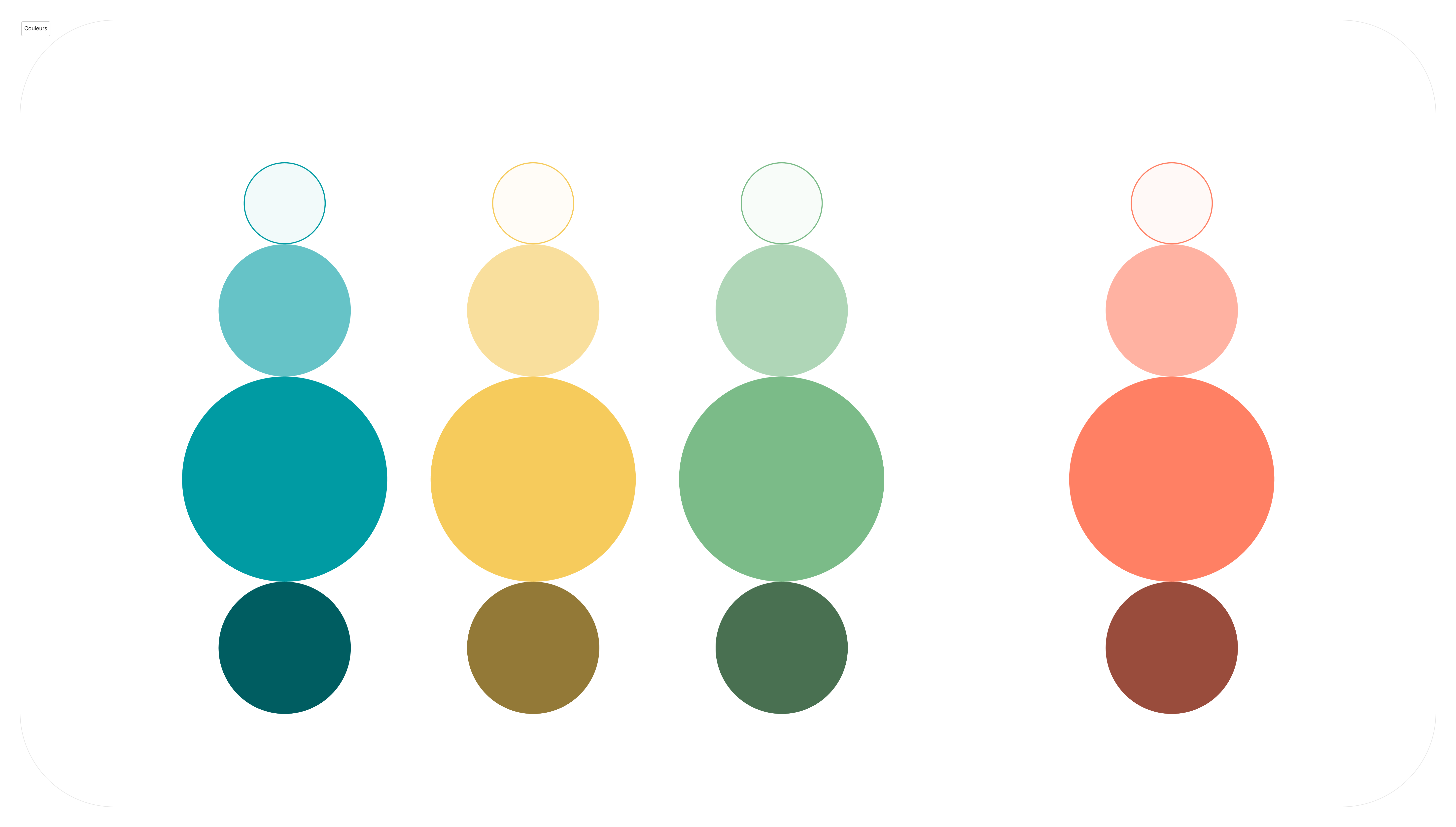
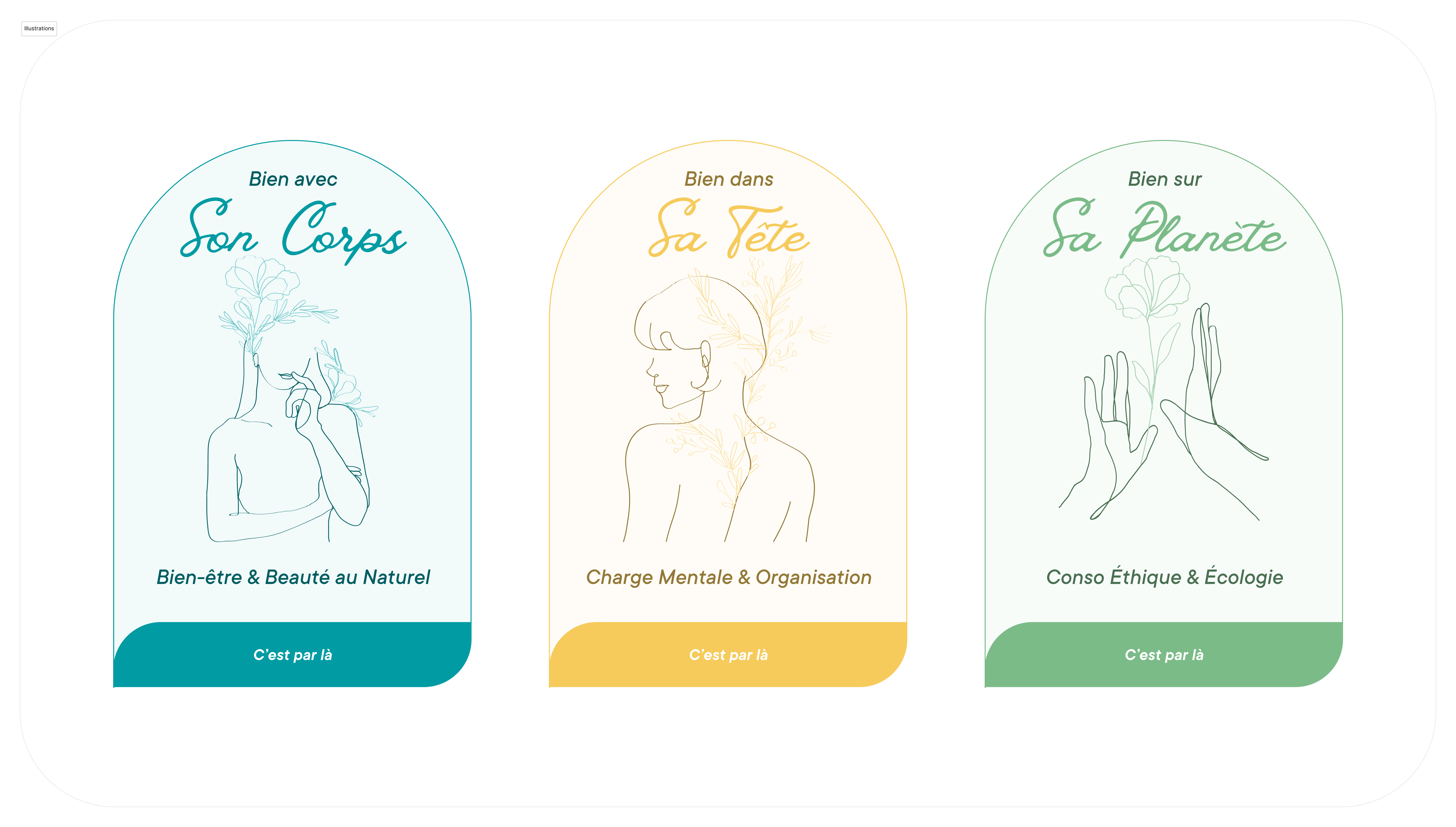
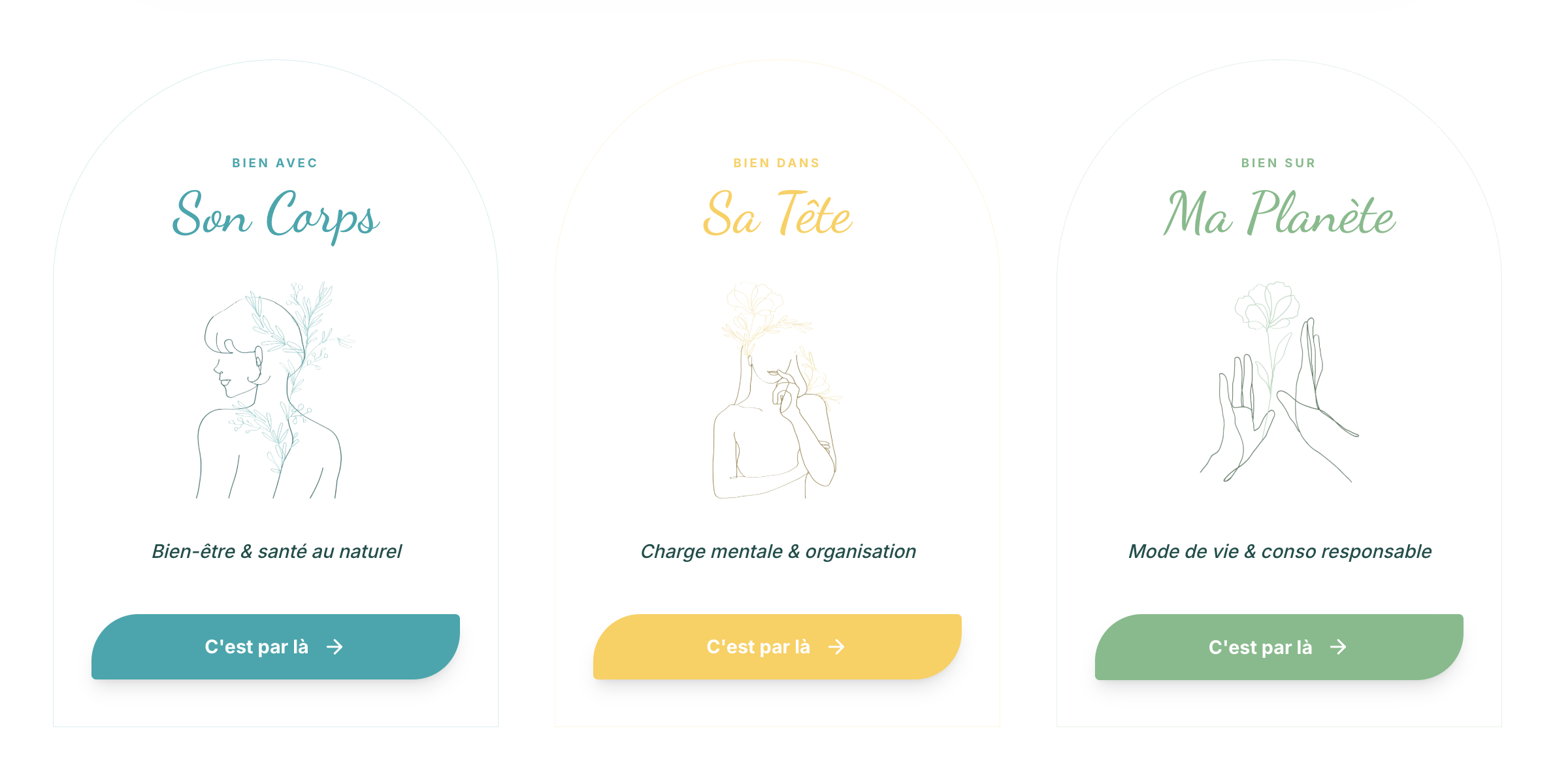
Azuria's visual identity unfolds as an invitation to serenity. The delicate logotype orchestrates the project's three verticals through a cohesive visual language. The colorimetry and organic shapes weave a reassuring hierarchy, anchoring the brand's legitimacy and reinforcing the bond of trust intimately linked to the health and nutrition sector.
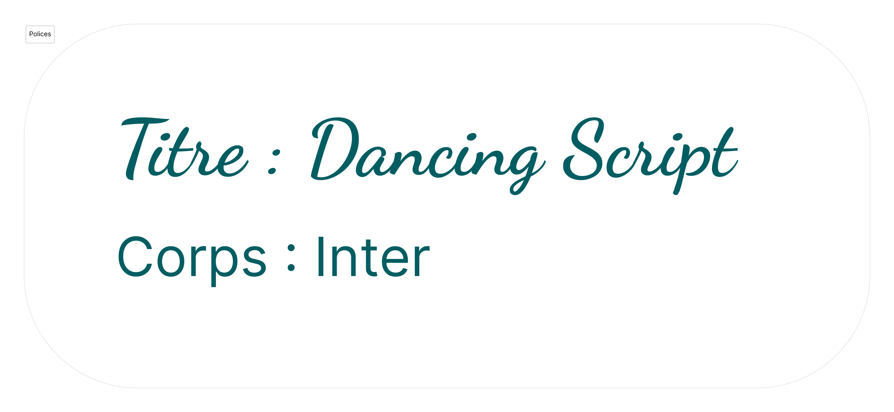
The typographic choice fell on the Dancing Script font. Its natural strokes bring a handwritten and embodied dimension, counterbalancing the rigor of digital interfaces with a touch of proximity that feels warm and elegant.