The all-in-one sticky bar: the whole product, without leaving the page


 2
 NOUVEAU
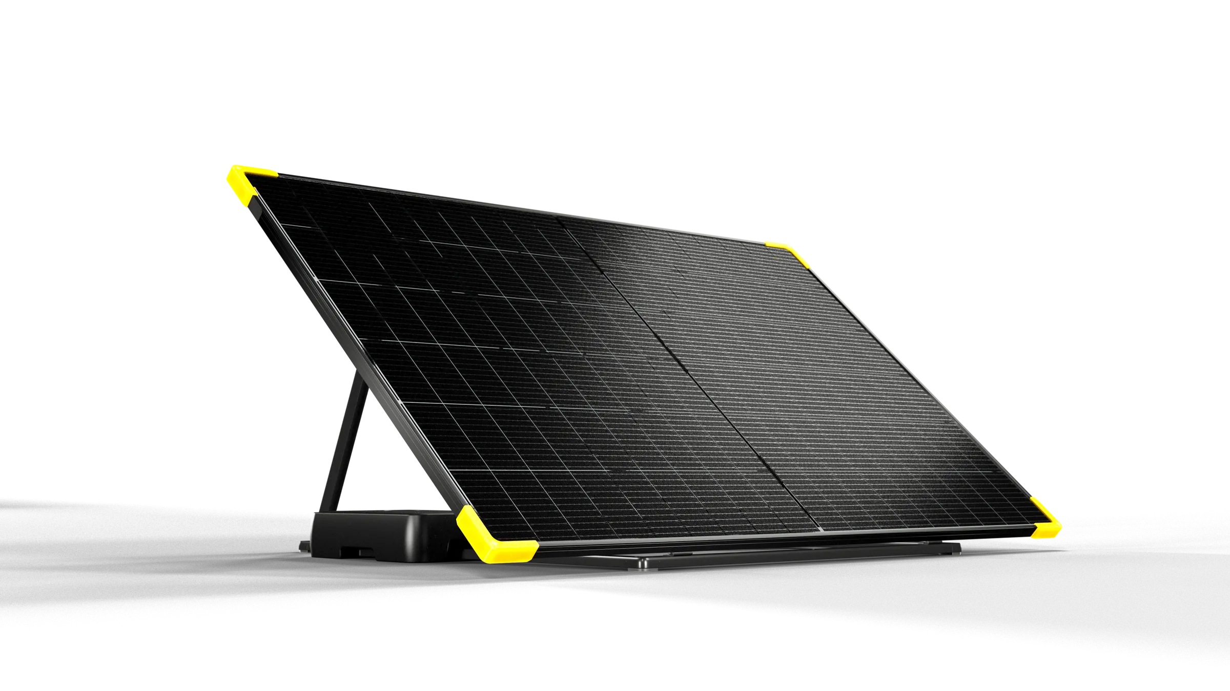
Mieux qu’un kit solaire, Sunology PLAY est la station solaire originale. Prête à l’emploi, conçue et assemblée en France et déjà vendue à plus de 100 000 exemplaires, il vous suffit de la sortir du carton et de la brancher sur une simple prise pour fabriquer votre propre électricité.
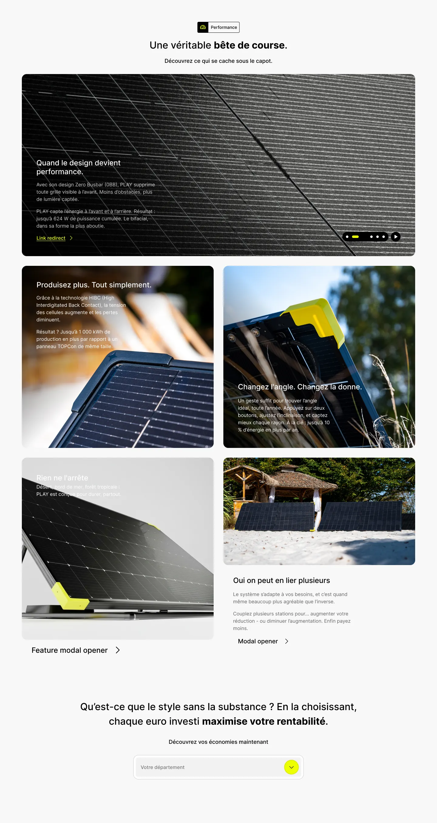
Une véritable bête de course.
Aucune grille visible à l’avant, l’énergie captée des deux côtés : jusqu’à 624 W de puissance cumulée.
Cellules à contact arrière : jusqu’à 1 000 kWh de production en plus qu’un panneau TOPCon de même taille.
Deux boutons pour trouver l’angle idéal, toute l’année : jusqu’à 10 % d’énergie en plus par an.
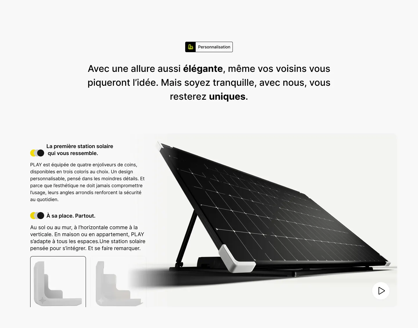
La première station solaire qui vous ressemble.
PLAY est équipée de quatre enjoliveurs de coins, disponibles en trois coloris au choix. Un design personnalisable, pensé dans les moindres détails.
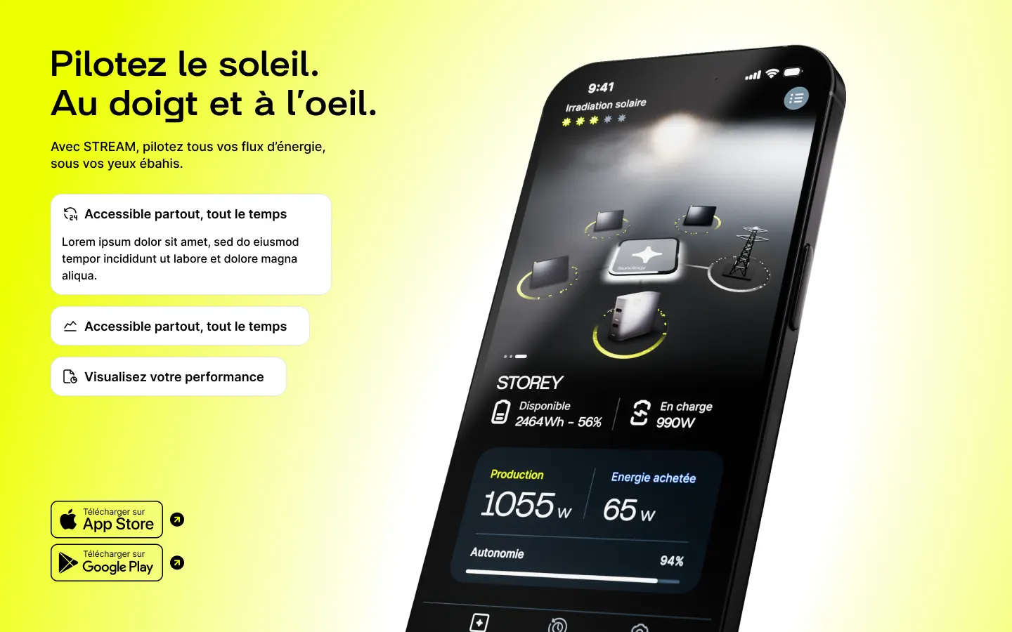
Pilotez le soleil. Au doigt et à l’œil.
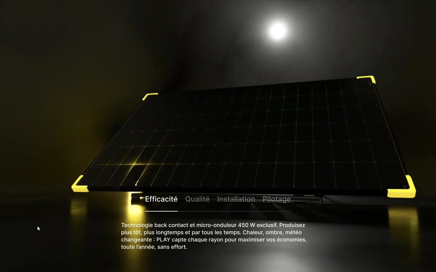
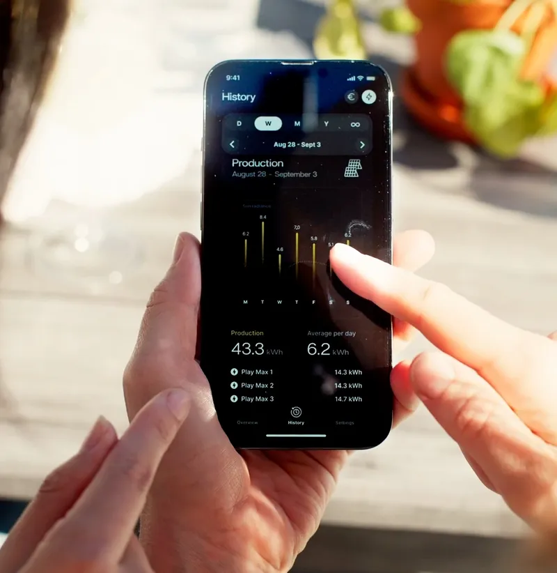
Avec STREAM, l’application de référence, levez le voile sur vos flux énergétiques et votre véritable coût au kWh.
 4,74,7


Scroll the page, then open an entry in the bar.
Context
All of Sunology's paid traffic lands on product pages. On PLAY, before buying, visitors have questions: what the station is worth, how to track it day to day, how to install it, what customers say. The answers existed, but scattered: at the bottom of the page, in the help center, on Trustpilot. Every detour takes people further from the purchase.
The PLAY page redesign was the chance to gather those answers in the bar that already carries the purchase: an all-in-one sticky bar that opens resources in place instead of sending people elsewhere.
Role
I designed this component end to end: the entry architecture, every button state, the two glasses, the behavior from desktop to mobile, and the motion. The prototype above was rebuilt for this portfolio from my mockups, to show what a static mockup cannot: how the bar sticks, opens and closes.
Goals
Purchase within reach
The name, the rating and “Buy now” stay visible wherever you are on the page.
Answer in place
App, manuals, reviews, FAQ: pre-purchase questions get answered without leaving the page.
One component
The same component, from wide screens to phones, with its states and motion.
Readable everywhere
A page that alternates dark photos and light sections: the bar has to stay readable over both.
The design decisions
Two kinds of entries
Not every entry in the bar does the same thing, on purpose. Specs takes you back into the page: the product content is already there, and duplicating it in a panel would have meant two versions to maintain.
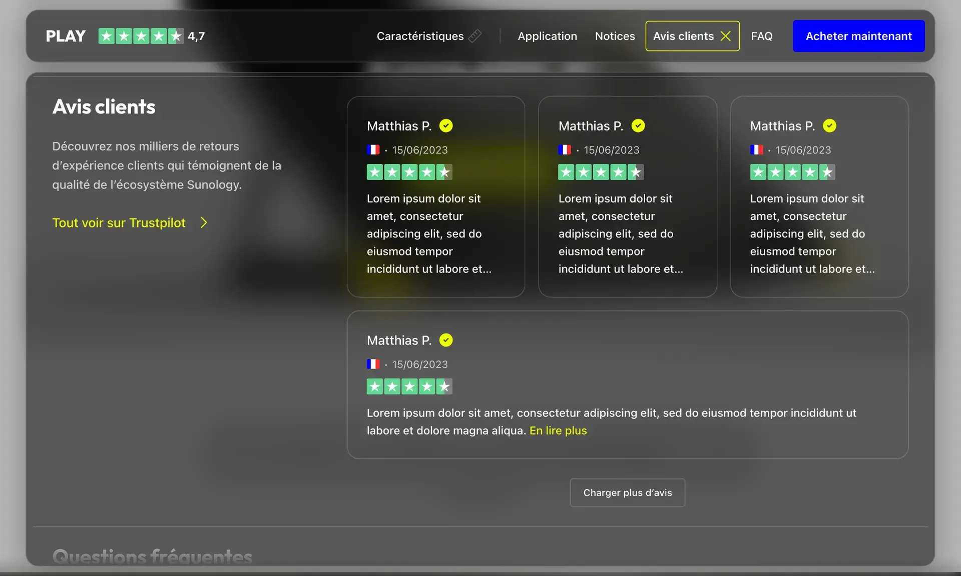
App, Manuals, Reviews and FAQopen what the page doesn't show, in a panel placed under the bar. A vertical line separates the two families, so the difference shows before the click.
From the black bar to glass
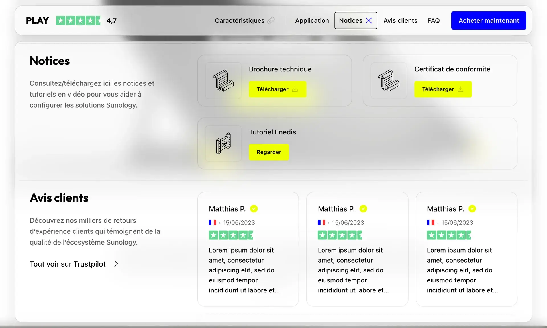
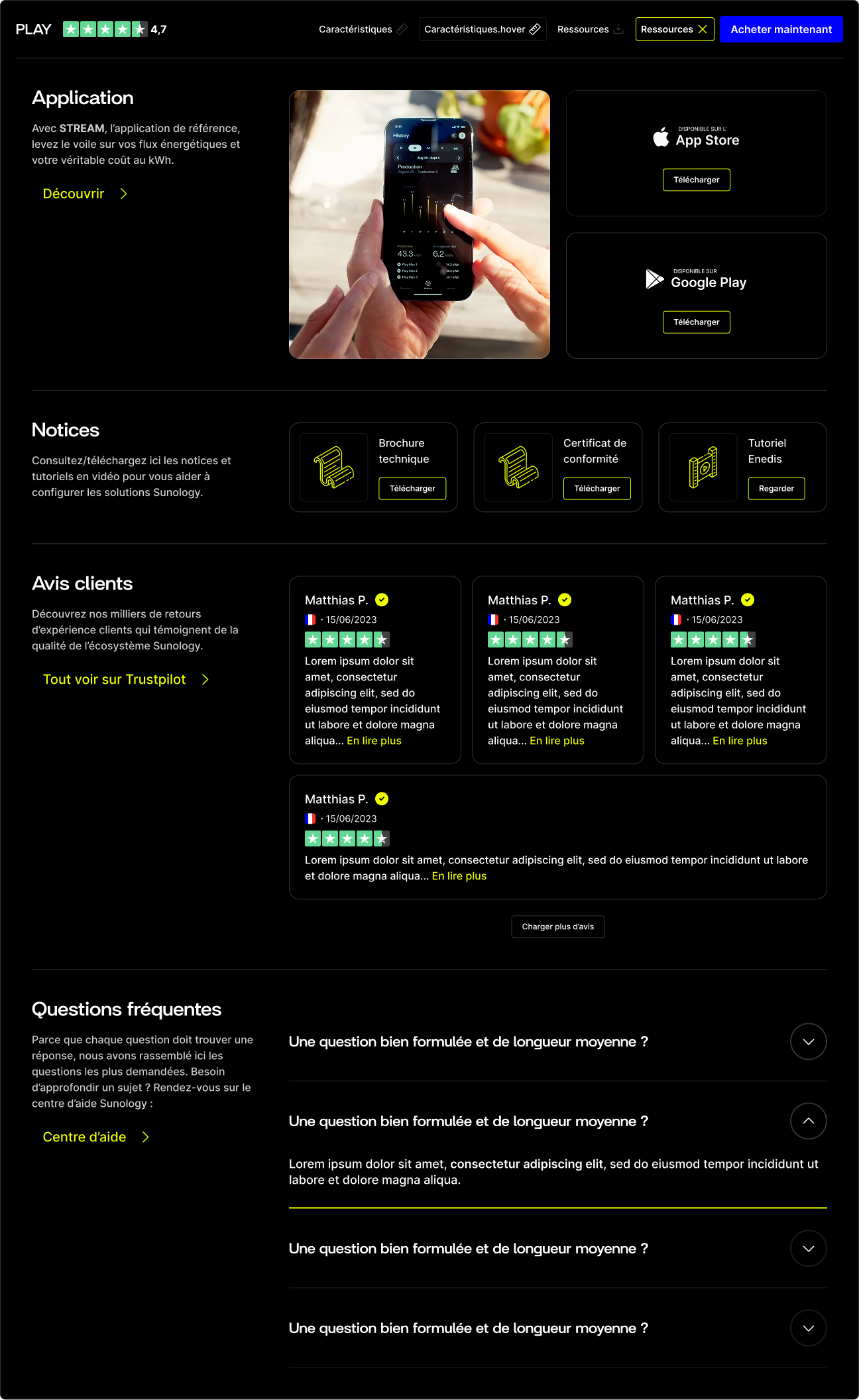
The first version was an opaque black block: the bar and its panel were one piece. Solid, but heavy on a light page, and it hid everything passing underneath.
Glass keeps the page visible under the bar, blurred. I designed two tints: a smoked glass that matches the dark product photos, and a clear glass, more editorial, with solid yellow actions. The panel becomes a separate glass card that drops from the bar over the veiled page.
Motion that connects
All of it shows in the prototype at the top of the page.
- 01One curve for the whole component, and openings slower than closings: arrivals are eased in, departures never make you wait.
- 02The panel drops from the bar that opened it, instead of appearing in the middle of the screen.
- 03A single outline for the active entry: it slides from one entry to the next and follows the section being read as the panel scrolls.
- 04The active entry’s icon turns into a cross, the hamburger crosses its lines: the close gesture always sits where the open gesture was.
- 05Content arrives in a cascade, 70 ms apart. If the system asks for reduced motion, everything appears at once.
On mobile, a menu
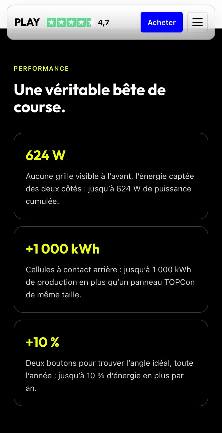
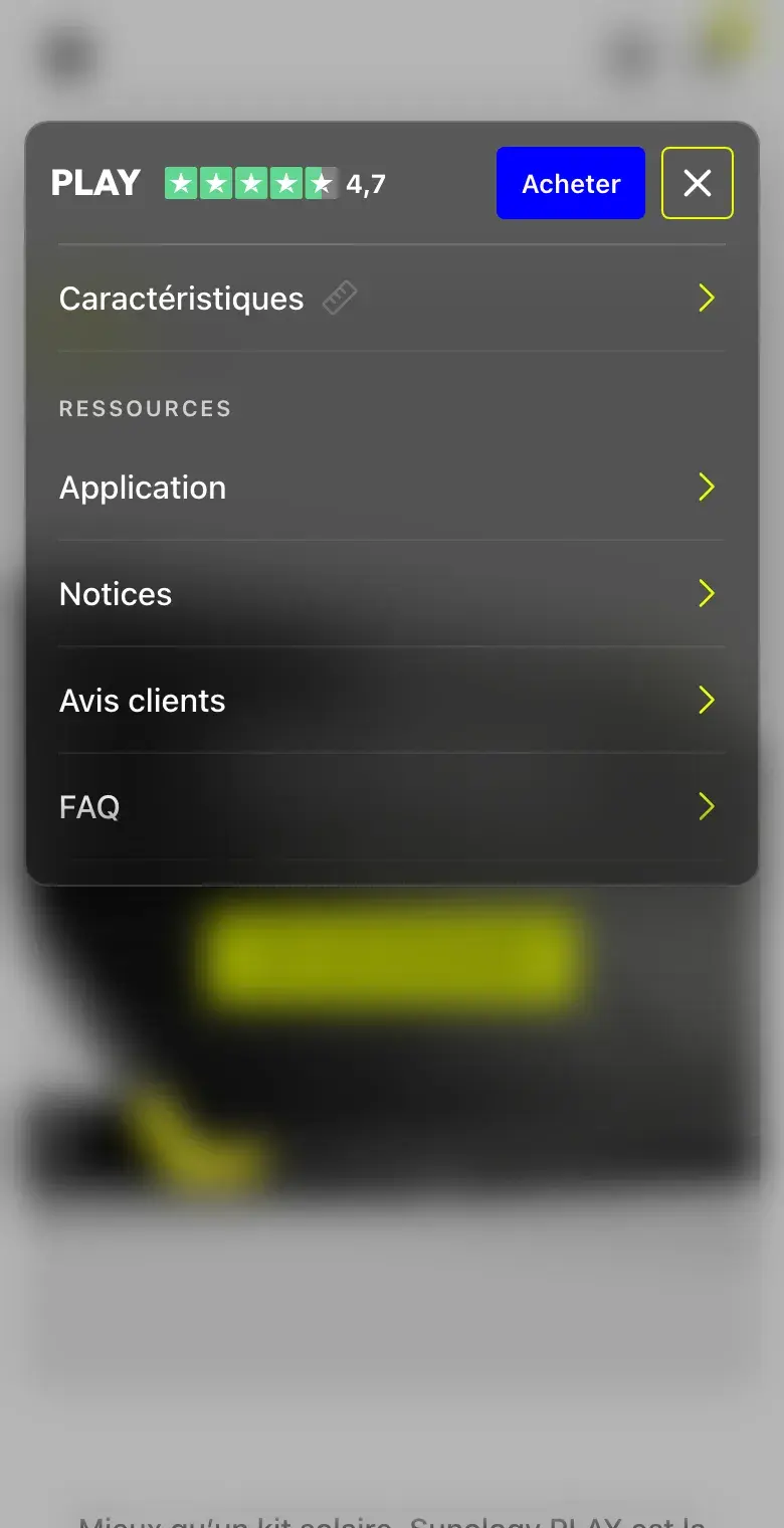
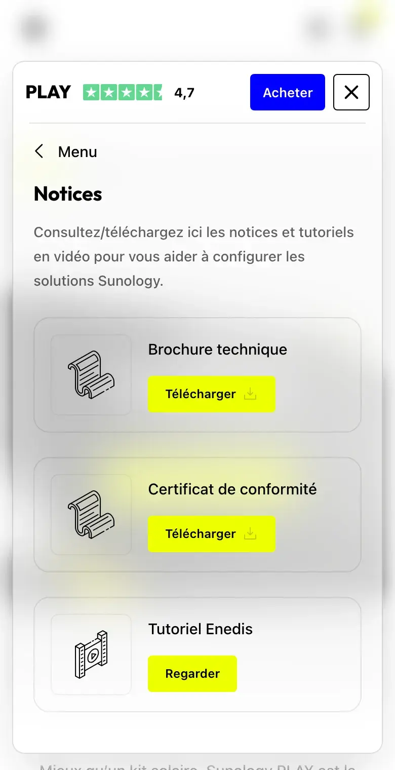
Five entries don't fit on a phone, and a horizontally scrolling list hides half the options. The bar keeps the name, the rating and the purchase; entries move behind a hamburger that unfolds the menu inside the bar itself. A resource opens on its own, with a way back to the menu: one thing at a time.
The details that matter
- Escape
- closes everything, and focus returns to the entry that opened it.
- Click outside
- on the veiled page closes it too.
- Wheel
- the page scrolls even when the pointer is over the bar.
- ARIA
- each entry announces its open or closed state and the panel it controls.